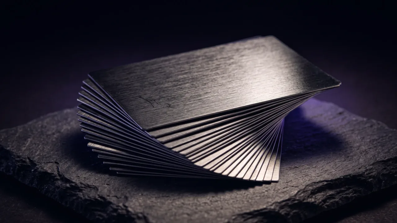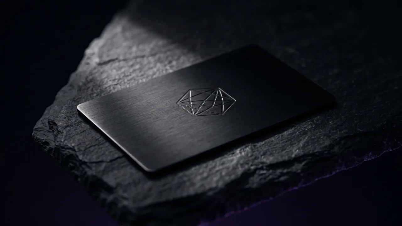
Most metal business card designs fail for one reason: they treat the metal like paper and fill every millimetre. The good ones do the opposite. They leave space, commit to a single finish, and let the material do the talking. Restraint is the whole design, and it is the part cheap cards skip.
Metal business card designs come down to three choices: the finish, the layout, and how the details are cut into the surface. Get those right and the card looks deliberate before anyone reads a word on it. This is a look at the finishes and layouts that work, the ones that don't, and how each carries a hidden NFC chip without showing it.
What makes a metal business card design work
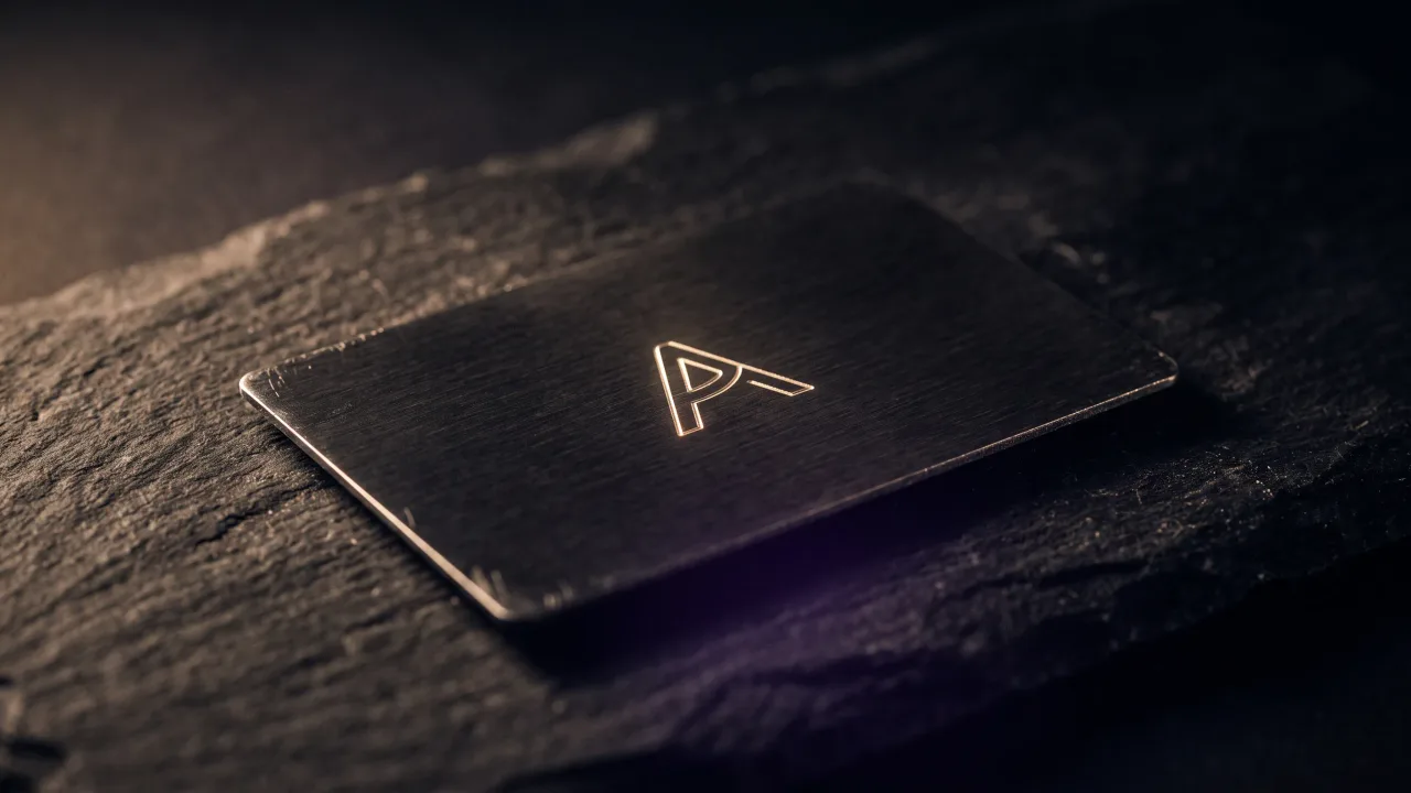
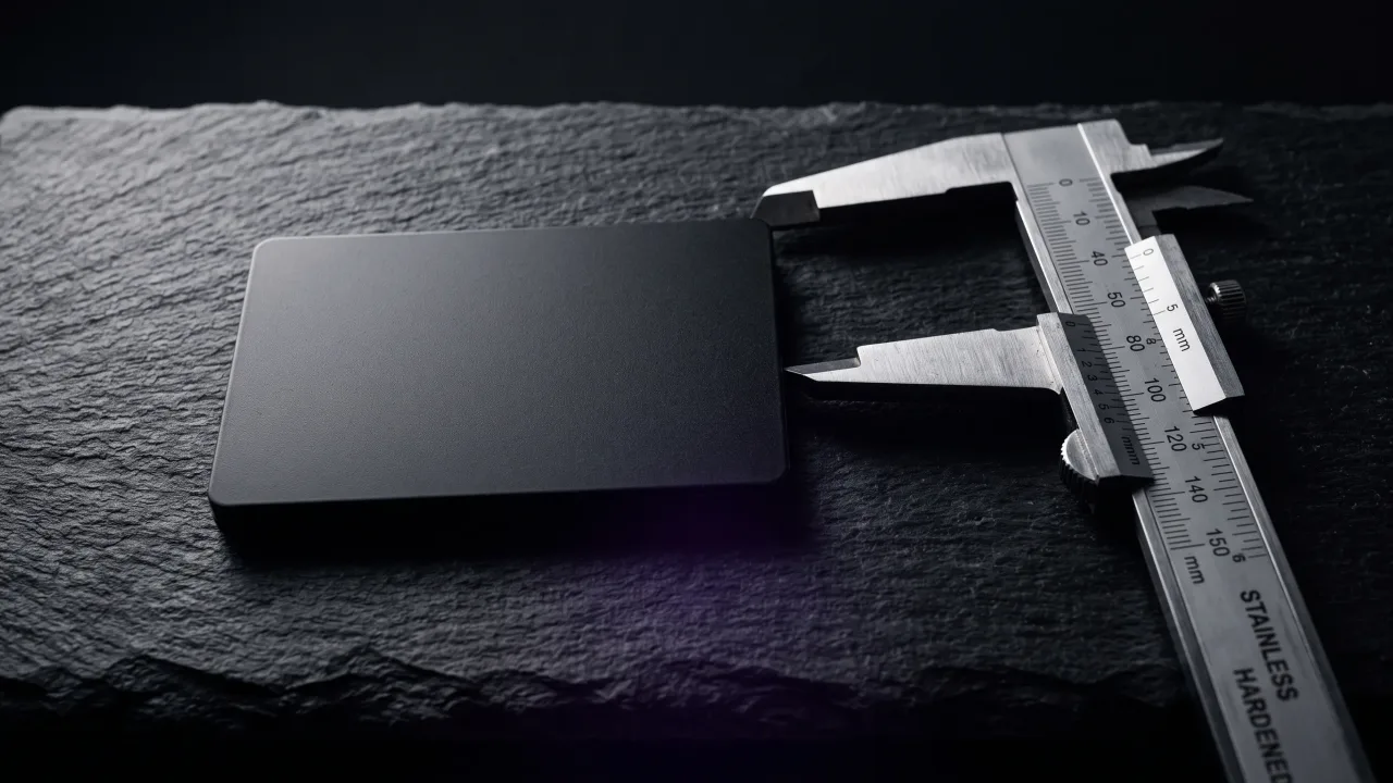
A metal card has one advantage paper never will: weight and surface. A design that fights that advantage by crowding the front with text, icons and a full-colour logo throws it away. The strongest metal business card designs use less, not more.
Three things decide whether a design lands. The finish sets the mood before the eye reaches any text. The layout controls where attention goes. The engraving depth and contrast decide whether the details read cleanly or vanish into the surface. Everything else is decoration, and metal punishes decoration. There is a reason an uncluttered, well-made object reads as more trustworthy, an effect Nielsen Norman Group calls the aesthetic-usability effect: people assume a card that looks considered was considered all the way through.
Metal card finishes: how each colour reads
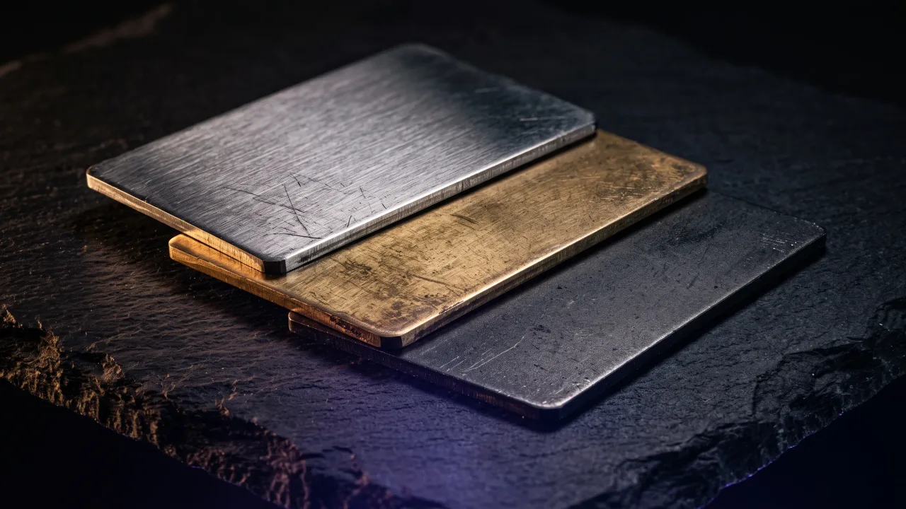
The finish is the loudest design decision you make, and it happens before you place a single letter. Most premium cards start from stainless steel, chosen because it takes a fine engraving and resists scratching. From there, each metal reads as a different kind of person.
- Black metal: the default for a reason. It reads modern and serious, and silver detailing engraved into it has the highest contrast of any finish.
- Silver metal: classic and neutral. Brushed steel that suits almost any profession without shouting.
- White metal: clean and understated, closer to a soft matte than a bright white.
- Rose gold metal: warmer and more distinctive, popular with creative and beauty professionals who want colour without going loud.
- Gold metal: the boldest of the set. It carries luxury signalling and works best with minimal engraving so it stays elegant rather than gaudy.
There is also a wood option, in dark, light and maple, for anyone who wants warmth over shine. Whatever the material, the finish matters more than the metal beneath it. A matte or brushed surface kills glare and keeps engraved detail readable, while a mirror polish looks striking in a photo and fights the light in a hand. You can see every finish against your own details in the configurator before you commit.
Six metal card layouts and who each suits
Layout is where a design either breathes or suffocates. A metal card holds less text than you think, so the arrangement of name, title and logo does most of the work. Six layouts cover almost every case.
- Classic: name and title stacked, logo top-left. The balanced choice that works for any field.
- Split: a dividing line down the card, contact details on one side and branding on the other. Structured and corporate.
- Modern bottom: name anchored to the lower edge with clear space above. Editorial and confident.
- Right aligned: everything pushed to one side, leaving a wide quiet margin. Minimal without feeling empty.
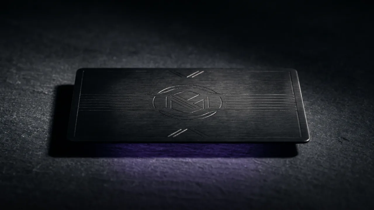
- Centered minimal: name in the middle, nothing else competing. The most restrained layout, and often the most premium.
- Bold name: the name set large as the main graphic element. Best for people whose name is the brand.
None of these is objectively best. A consultant tends to want classic or split; a designer or photographer usually reaches for centered minimal or bold name. The rule that holds across all six: pick one focal point and let the rest of the card stay quiet.
Engraved or printed: what design choices survive
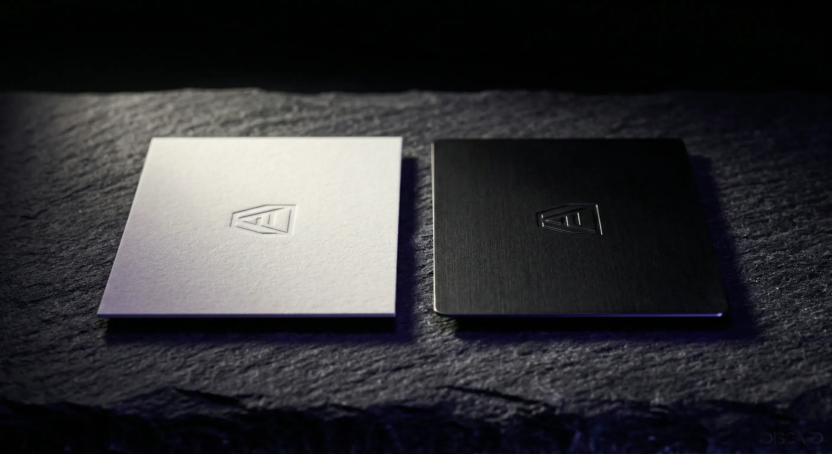
Two methods put a design onto metal, and they age nothing alike. Laser engraving cuts the design into the surface, so it becomes part of the card and cannot rub off. UV printing lays ink on top, which allows full colour but wears at the edges after years in a wallet.
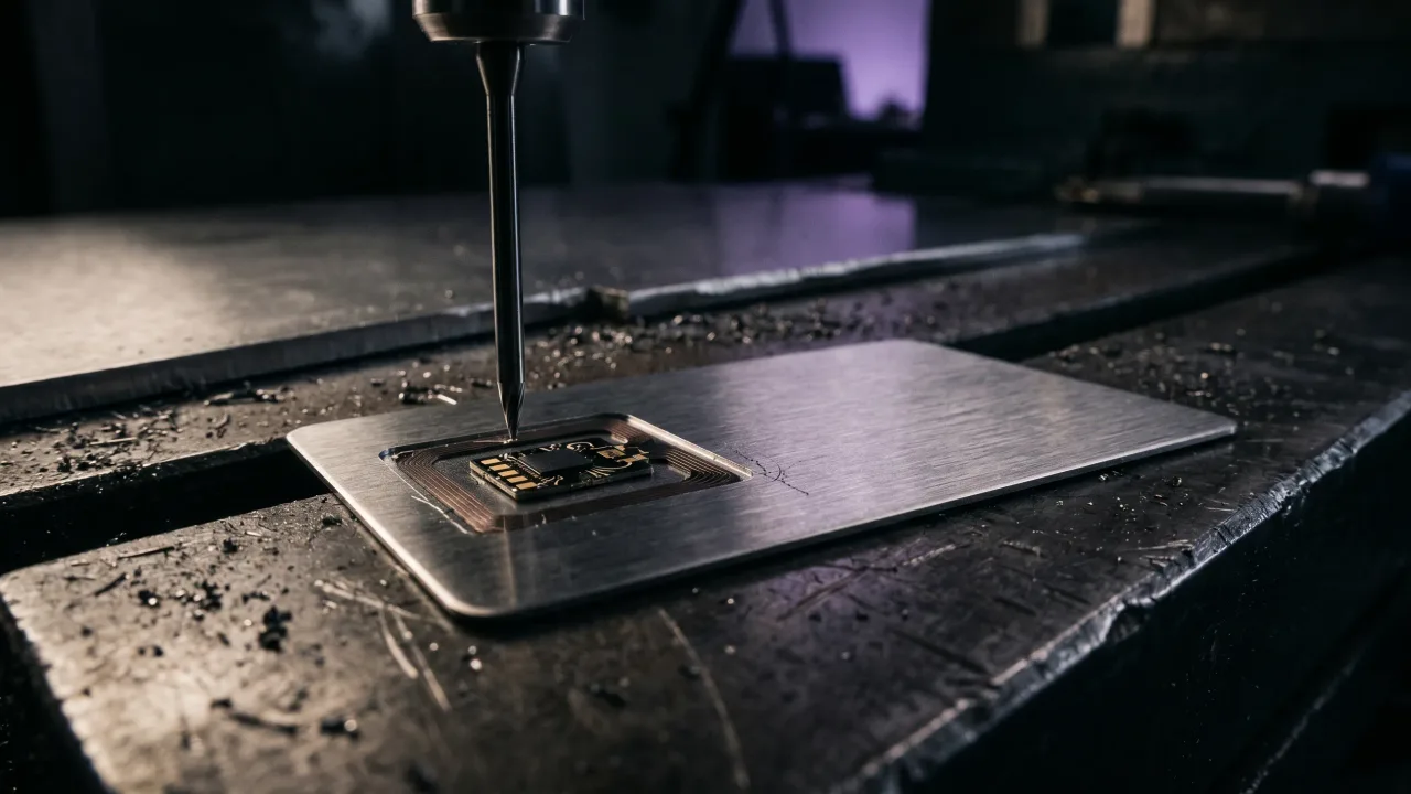
For a card meant to outlast a job title, engraving wins. A laser burns the lines into the metal at high contrast against a matte finish, and the result survives keys and coins. It also shapes what your design can be. Fine, high-contrast linework and clean type engrave beautifully; a busy full-colour photo does not. We walk through the full process in how metal NFC business cards are made. If your design leans on a gradient or a photograph, metal is the wrong canvas. If it leans on a strong mark and clean type, metal makes it look better than paper ever could.
Designing around the chip and the QR code
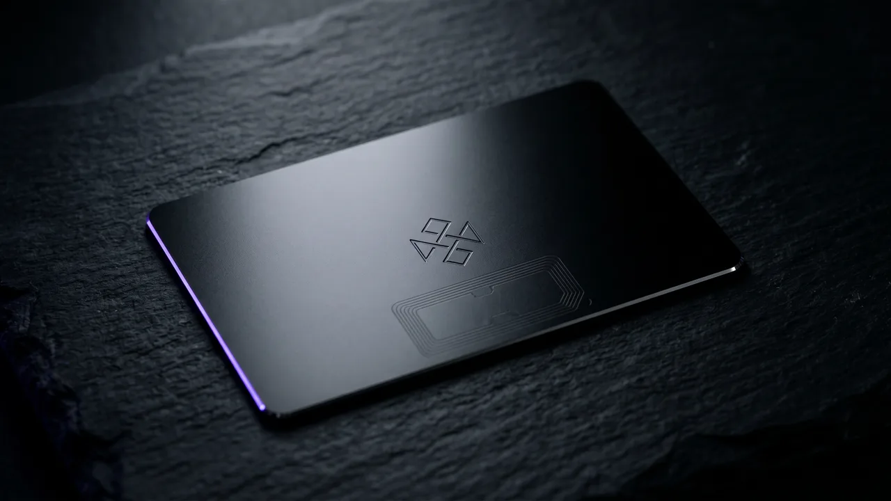
A Discard card is a design object and a working tool at once. The NFC chip sits inside the card, invisible, so the surface design never has to account for it. What the design does have to make room for is the QR code, the backup that lets any camera reach the same profile when a tap is not an option.
The back of the card is the natural home for a QR code, which keeps the front clean for your name and mark. That split between a considered front and a functional back is a design principle in itself, and we cover what belongs on the reverse in what to put on the back of a business card. Both the tap and the scan open the same digital profile, so the design on the metal stays fixed while the details behind it stay editable.
Metal business card design ideas by profession
The best metal business card design is the one that matches the person holding it out. A few directions that consistently work:
- Consultants and finance: black or silver metal, classic or split layout, one accent line. Authority without noise.
- Designers and photographers: centered minimal or bold name on black metal, type doing all the work. The restraint signals taste.
- Beauty and lifestyle: rose gold with a soft serif and a light layout. Warm and distinctive.
- Founders and executives: gold or black metal, a single strong mark, nothing else. Scarcity as a design language.
- Architects and studios: white or silver metal, geometric type, wide margins. The card should feel like their work.
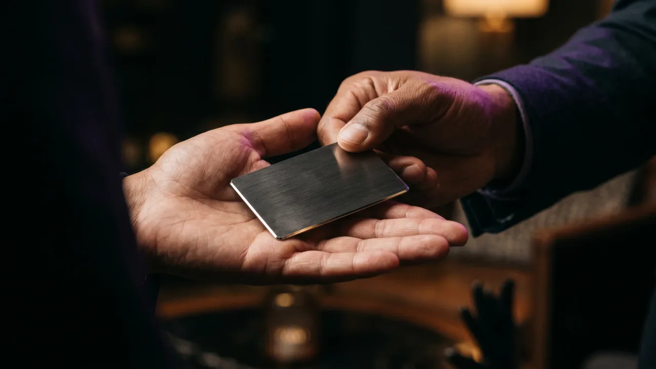
We go deeper on the impression a premium card makes in the psychology of a premium first impression. The pattern under all of these is the same: choose a finish that fits the field, one layout, one focal point, and stop there.
Metal card design mistakes that cheapen a premium object
A metal card can look cheap, and it almost always happens the same way. The design tries to do too much, and the material stops working for you.
- Cramming the front with an address, two phone numbers, an email, a website and social handles. A smart card carries all of that in the profile, so the metal only needs a name and a mark.
- A mirror-polished finish under fine engraving. The glare eats the detail. Matte or brushed reads better in a hand.
- Three or four fonts. One typeface in two weights is plenty on a surface this small.
- A full-colour photo logo printed on top. It looks sharp on day one and wears by year three. Simplify it to a mark that engraves.
- Light engraving on a light finish. If the details do not read at arm's length, the design has failed.
The comparison that makes all of this concrete is a metal card against the paper one it replaces, which we lay out in paper vs metal NFC business cards. Paper hides a weak design behind disposability. Metal shows everything, which is exactly why the restrained designs win.
The verdict on metal business card designs
Good metal business card designs are the restrained ones. They pick a finish, commit to a single layout, and cut clean high-contrast detail into a matte surface, then stop. Black metal with silver engraving is the safe premium default; rose gold, gold and white give you range when the field calls for it. Match the layout to the person, keep one focal point, and let the material carry the rest. The chip stays hidden inside, the QR code lives on the back, and the profile behind both stays editable for as long as you own the card. A metal card exposes every design decision you make. That is the reason to make fewer of them, and to make each one count.
Try every finish and layout against your own name and logo, and see the design on real metal before you order.
Design your cardFrequently asked questions
What is the most popular metal business card design?
Black metal with silver laser engraving and a minimal layout is the most popular metal business card design, because the contrast is the highest of any finish and the restraint reads as premium. A single name, a clean mark and a matte surface do most of the work. It suits almost any profession.
What finishes do metal business cards come in?
Common finishes are black, silver, white, rose gold and gold metal, plus wood options in dark, light and maple. Matte and brushed finishes keep engraved detail readable, while mirror-polished surfaces look striking but fight the light. The finish sets the mood before anyone reads the text.
Should a metal business card design be minimal?
Usually yes. Metal exposes every element, so a crowded front looks cheaper, not richer. The strongest designs keep one focal point, one typeface and wide quiet margins, and push the rest of the contact details into the digital profile behind the card.
Can you print full colour on a metal business card?
You can UV-print colour on metal, but it wears at the edges over years and suits gradients or photos poorly. Laser engraving lasts longer and holds far higher contrast, so most premium designs use engraving and reserve colour for the finish of the metal itself.
How many fonts should a metal business card use?
One typeface in two weights is plenty. A surface this small cannot carry three or four fonts without looking busy, and busy is the fastest way to make a metal card look cheap. Let the finish and layout add the variety instead.
Do metal business card designs work with NFC?
Yes. The NFC chip sits inside the card, so it never affects the surface design, and a QR code on the back covers phones that cannot tap. Both open the same editable profile, which means the metal design stays fixed while your details stay current.