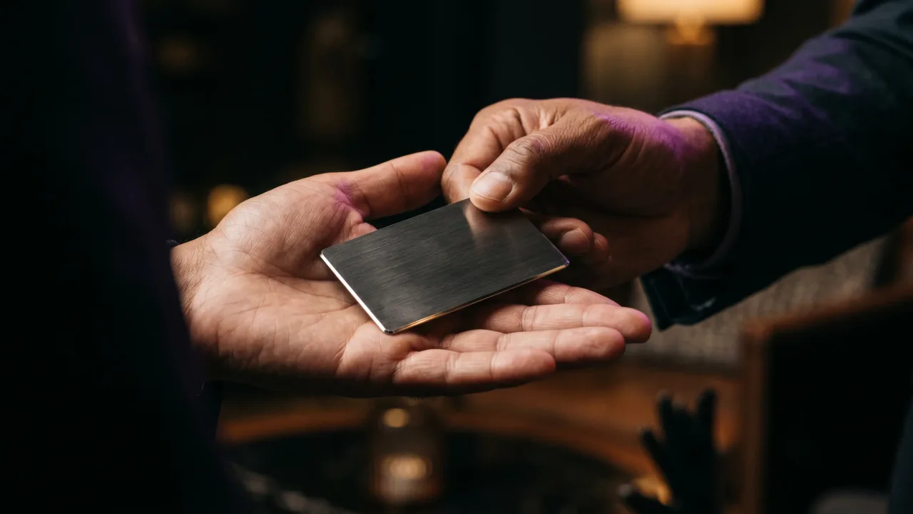
Most advice on what to put on the back of a business card assumes you ran out of space on the front. On a metal NFC card the opposite problem shows up. The chip already holds your number, your links, and your booking page, so the back has nothing it has to carry.
That leaves a design question instead of a packing problem. When the contact details live in the tap, the back of the card stops being storage and becomes a surface. You can engrave one mark, one line, or nothing at all, and each choice says something before the other person has read a word. The only decision left is what earns a place on the back, and what to leave as bare metal.
Why the back of a paper business card is usually wasted
On a paper card the back is treated as bonus inventory. People either leave it blank to save a few cents or cram it with a services list, a map, a coupon, and three social handles. Both are a reaction to the same constraint: the front is too small to hold a working profile, so the back becomes overflow.
The clutter rarely works. A back covered in offers reads as a flyer, not a card, and a flyer is easy to bin. The blank back is honest but mute, a missed half of an object you paid to print twice. Neither version is designed; both are defaults. The whole debate over what to put on the back of a business card exists because the front could never do its job in the first place.
What changes when the contact info lives in the chip
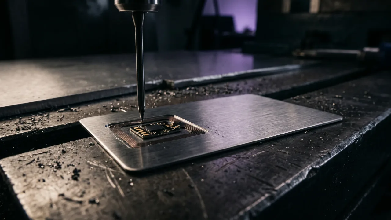
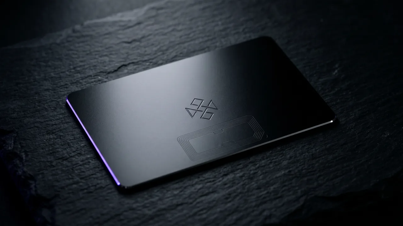
A metal NFC card moves every contact detail off the printed surface and into the tap. Near-field communication is the same short-range standard your phone uses for contactless payment, as Wikipedia's overview of near-field communication explains, and it carries a web link the moment the card touches a phone. Your number, email, links, and calendar load from your digital profile, not from anything printed.
Once the data is in the chip, the card no longer has to be readable. It only has to be felt and recognised. That single shift is what frees the back. There is nothing it must say, so everything it does say is a choice rather than a requirement, and choices are where design starts.
The case for leaving the back almost empty
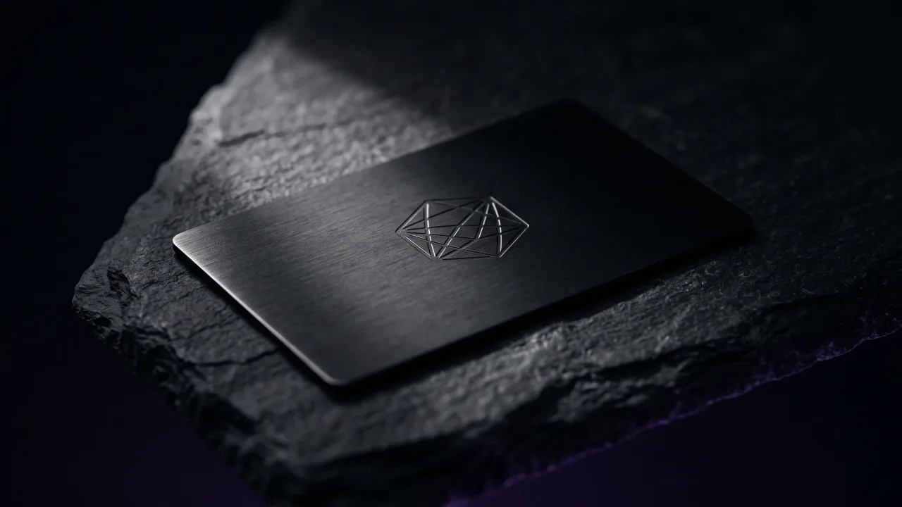
Restraint is the strongest move available on a metal card. A back with one engraved mark and a wide field of brushed or matte metal reads as confidence. It signals that you did not need to sell on the card itself, because the work and the profile do that job. The aesthetic-usability effect documented by the Nielsen Norman Group describes how a clean, considered surface is judged as more trustworthy, even before anyone tests it.
Negative space is not empty space. In design it carries weight and focus, which is why premium packaging leaves so much of it. Smashing Magazine's writing on using white space for readability makes the same point for screens: the room around an element is what lets the element land. On a metal back, the untouched metal is the design, and the single engraved detail is what it frames.
What actually earns a place on the back of a metal card
A short list survives the restraint test. Each item has to do one job well and not compete with the others, and most backs are better off using only one of them.
| What to put on the back | Why it works on metal | When to skip it |
|---|---|---|
| Your name or monogram, engraved | Makes the card an object that is yours, not a template | Almost never; this is the one mark worth engraving |
| A single logo mark | A clean brand cue without a line of copy | If the front already carries the logo |
| One short tagline | Says what you do in the half-second before the tap | If it reads as a slogan rather than a plain fact |
| A small QR code | A fallback for phones that cannot tap | If your audience all carry modern smartphones |
| Nothing at all | Lets the material and weight do the talking | If the brand genuinely needs a visible mark |
The rule underneath all of it is one idea per side. Pick the single element that says the most and engrave that, then stop. A name in a clean typeface on bare metal outperforms a back trying to be a brochure, because the recipient registers one clear signal instead of sorting through five weak ones. If you cannot decide which element wins, that is usually a sign the front of the card is doing too little, not that the back needs more.
Should you put a QR code on the back of your business card?
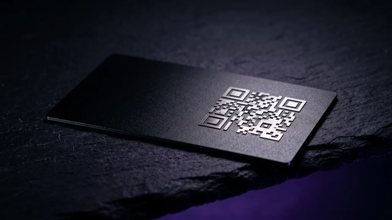
A QR code earns its place only as a fallback. The tap is faster and needs no aiming, but a small share of older phones cannot read an NFC card, and a QR code covers them without forcing anyone to ask. We put the two formats side by side in NFC vs QR code business cards.
Keep it small and put it where it does not fight the engraving. A discreet code in a corner gives the few people who need it a route in while leaving the surface clean for everyone else. If your audience is entirely modern smartphones, you can drop it and let the chip carry the whole load.
Designing the back of a metal card: engraving, finish, and balance
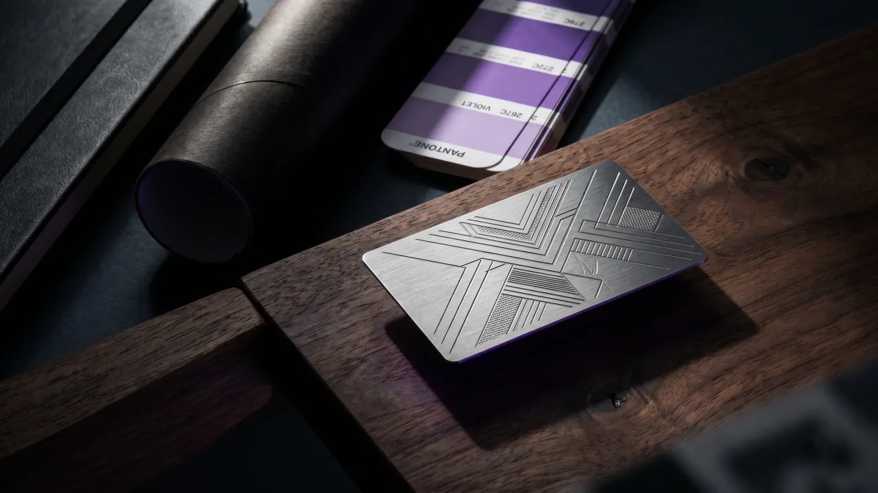
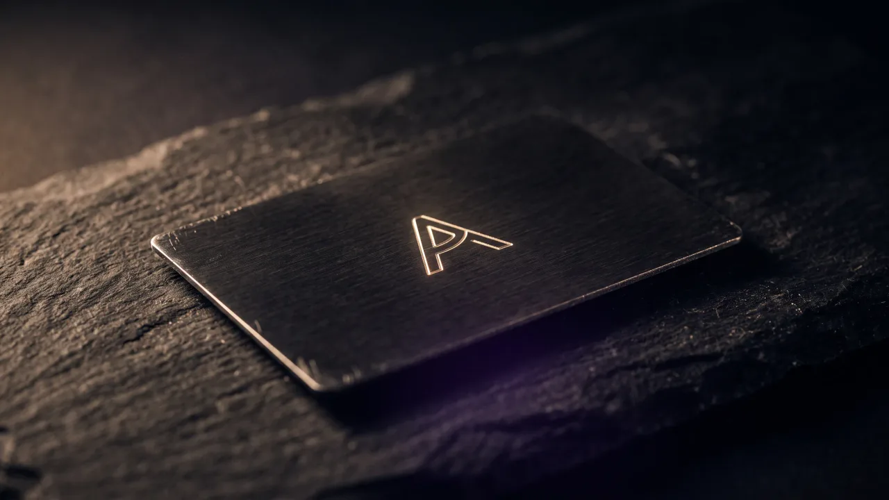
The back of a metal card is engraved, not printed, so the design rules are different. Laser engraving cuts the mark into the surface, which means thin lines, small type, and dense logos can lose definition. Simple, slightly heavier shapes hold up best, and a monogram or a clean wordmark reads more sharply than a detailed illustration.
Size is the constraint people forget. A card is small, and the back is smaller once you account for the engraving margin, so a logo that looks sharp on a screen can turn to mush at card scale. Test the mark at actual size before you commit, because what reads on a monitor at 400 percent is not what the recipient holds. When in doubt, simplify the shape and raise the contrast against the finish.
Finish changes how the back reads as much as the engraving does. A matte black surface makes an engraved mark catch the light; a brushed steel back gives it a quieter, technical feel. You can see how each finish handles engraving on the materials page, and the same name will feel different depending on which one sits behind it.
What to leave off the back entirely
Some paper-card habits do not survive the move to metal. A list of services, a coupon, a block of fine print, or a wall of social icons all pull the card back toward looking like an advert, and they undo the restraint that makes a metal card feel premium. The profile already holds all of it, so printing it again is noise.
The weight of the object is part of the message, and clutter cancels it. People judge competence from small physical cues in the first seconds of a meeting, and heavier, cleaner objects read as more serious, a point we cover in the psychology of a premium first impression. A back crammed with marketing fights that signal. Leave the selling to the profile and let the card be the object.
The verdict: what belongs on the back
The back of a business card stopped being a storage problem the moment the contact details moved into the chip. On a metal NFC card you are not deciding how to fit everything on; you are deciding what one thing deserves the space. In almost every case the answer is less than you think: your name or mark engraved into a clean finish, a small QR code only if your audience needs the fallback, and a wide field of bare metal doing the rest. The profile carries the information. The back carries the impression.
Design the back of your card the way it should be: one engraved mark on a finish you choose, with every detail living in a profile you update in seconds.
Design your cardFrequently asked questions
What should you put on the back of a business card?
On a metal NFC card, put one thing: your name, monogram, or logo engraved into the finish, with an optional small QR code as a fallback. The contact details live in the chip and your digital profile, so the back is for a single clear signal, not a second page of information.
Should the back of a business card be blank?
A near-blank back is a strong choice on a premium card. A wide field of bare metal with one engraved mark reads as confident and considered. On a paper card a blank back can feel like a missed opportunity, but on metal the material itself is the design.
Should I put a QR code on the back of my business card?
Only as a fallback. An NFC tap is faster and needs no aiming, but a small QR code covers the few phones that cannot read the chip. Keep it small and out of the way, or drop it entirely if your audience all carry modern smartphones.
What do you put on the back of an NFC business card?
As little as possible. Because the NFC chip already holds your number, links, and booking page, the back only needs your name or brand mark engraved cleanly. Adding a services list or coupons works against the premium feel the metal is there to create.
What should you not put on the back of a business card?
Avoid clutter: long service lists, coupons, dense fine print, and a row of social icons. They make a premium card look like a flyer and repeat information your digital profile already carries. One clear element beats five competing ones.
Does engraving the back of a metal card cost extra?
It depends on the design, not the side. Engraving a simple name or monogram on the back is straightforward; intricate logos or very fine detail can need adjustment, because laser engraving favours clean, slightly heavier shapes. You can preview how a design engraves in the configurator before ordering.