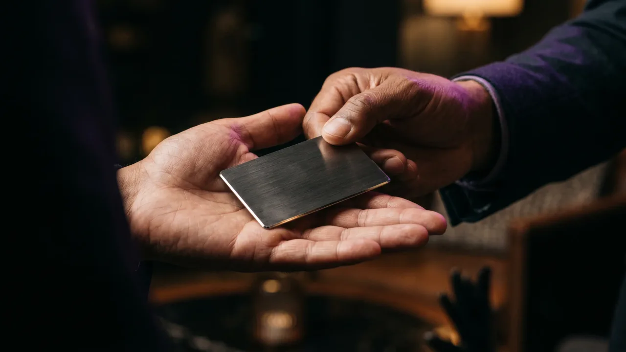
Hand someone your card and watch their eyes. They find your name, look for what you do, and decide whether the card goes into a pocket or stays on the table. The whole verdict takes about as long as it took you to read this paragraph.
So what makes a good business card is mostly what happens in those few seconds. Design awards and clever die-cuts matter far less than whether a stranger can read you at a glance and find you again next week. These are the rules we use when we look over the cards people design in our configurator.
What makes a good business card, in one sentence
A good business card makes you easy to recognise now and easy to contact later, with nothing on it that gets in the way of either. Every design decision either helps one of those two jobs or adds noise.
That sounds obvious, and most cards still fail it. They try to carry a logo, a slogan, four phone numbers, three social handles and a map. The person holding it has to work out what matters, and people rarely bother.
Put your name first and everything else second
Your name is the one thing the reader must get right, so it should be the first thing their eye lands on. Make it the largest text on the card, or give it the strongest contrast. Your role sits just under it, smaller. Contact details come last and smallest.
Designers call this visual hierarchy. The Nielsen Norman Group's guide to visual hierarchy describes the same tools a card uses: size, contrast and grouping decide what people notice first. On a card the size of a bank card you only get one focal point, so choose it on purpose.
A logo can share that top spot if you run a company and the brand is what people will remember. It shouldn't compete with your name at the same size. If both are the same size, the eye bounces between them and settles on neither.
Fewer lines and more empty space
White space is the cheapest premium finish there is. A card with five lines and wide margins reads as confident. The same card with twelve lines packed edge to edge reads as a flyer.
For most people the front needs only a name, a role, a company and one way to reach them. Everything else can move to the back or off the card entirely. We wrote a separate guide on what to put on the back of a business card, because the back is where a QR code, a short line about your work or nothing at all can live without crowding the front.
This is the practical case for a minimalist business card. If your card opens a digital profile, the profile can hold the long list: every number, your portfolio, your calendar link. The card only needs to be good enough to make someone tap it.
Type you can read in bad light
People read business cards in conference halls, taxis and dim restaurants. A thin, elegant script that looks lovely on your monitor turns into a grey smudge at arm's length in a bar.
Pick one typeface, two at most. A clean sans-serif or a sturdy serif for the contact lines, and if you want character, save it for your name. On business card font size, printers usually advise against going below 7 or 8 pt for contact details. We'd stay at the top of that range on a dark card.
Contrast matters as much as size. The web accessibility standard asks for a contrast ratio of at least 4.5:1 for normal text. A card isn't a web page, but the rule of thumb carries over well: grey on silver or pale gold on white will look refined in the mock-up and fail in a hand.
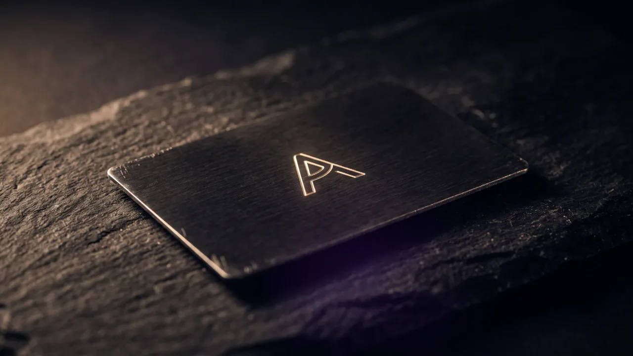
Engraving adds one more constraint. A laser cuts every stroke into the surface, and very fine hairlines can break up or vanish. If you pick an engraved finish, choose a regular or medium weight rather than a light one. Our configurator lets you try fonts on the actual material before you order, which settles most of these debates in a minute.
The material does half the talking
Before anyone reads a word, they feel the card. Thin paper bends in the hand and says you ordered the cheapest box. A heavy stock, wood or metal changes how long people hold it and how carefully they put it away.
There is some research behind the instinct. A 2010 study reported by MIT News found that people holding a heavier clipboard rated a job candidate more seriously. A later replication didn't find the same effect, so treat it as a hint rather than a law. Anyone who has been handed a metal card and weighed it in their palm knows the reaction we're describing.
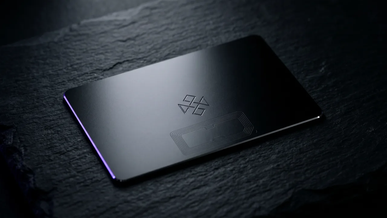
Our metal cards are stainless steel, 0.8 mm thick and 25 to 30 g, and you can read more about what metal business cards are made of. We're biased, obviously. The point holds for paper too: a good card stock costs a little more and does more for you than any extra line of text.
A next step the card can actually deliver
A card that people can't act on is a souvenir. The best cards give the reader one obvious next move: scan a QR code, tap the card to a phone, or visit a short URL that's easy to type.
The problem with printed details is that they go stale. You change jobs, phone numbers or titles, and every card in circulation now points to the wrong place. A card that opens a profile you can edit keeps working after those changes, which is half the reason NFC cards exist.
Whatever route you choose, test it before you order 500 copies. Scan the QR code with two different phones. Type the URL yourself. A broken next step is worse than none, because the reader gave you a second chance and you wasted it.
Common mistakes that make a card look cheap
Most bad cards fail in a handful of predictable ways:
- Text running too close to the edge, where trimming can cut it off.
- Three or more fonts competing on one side.
- A low-resolution logo that turns blurry in print.
- Every social network you've ever joined, listed in a row.
- Crossed-out or handwritten corrections after a job change.
- Glossy coatings that make handwriting a note on the card impossible.
- Typos. Read every digit of your phone number twice.
None of these needs a designer to fix. They need one honest look at the proof, ideally by someone who doesn't know your phone number by heart. For ideas that go further, our gallery of metal business card designs shows how finishes and layouts change the feel.
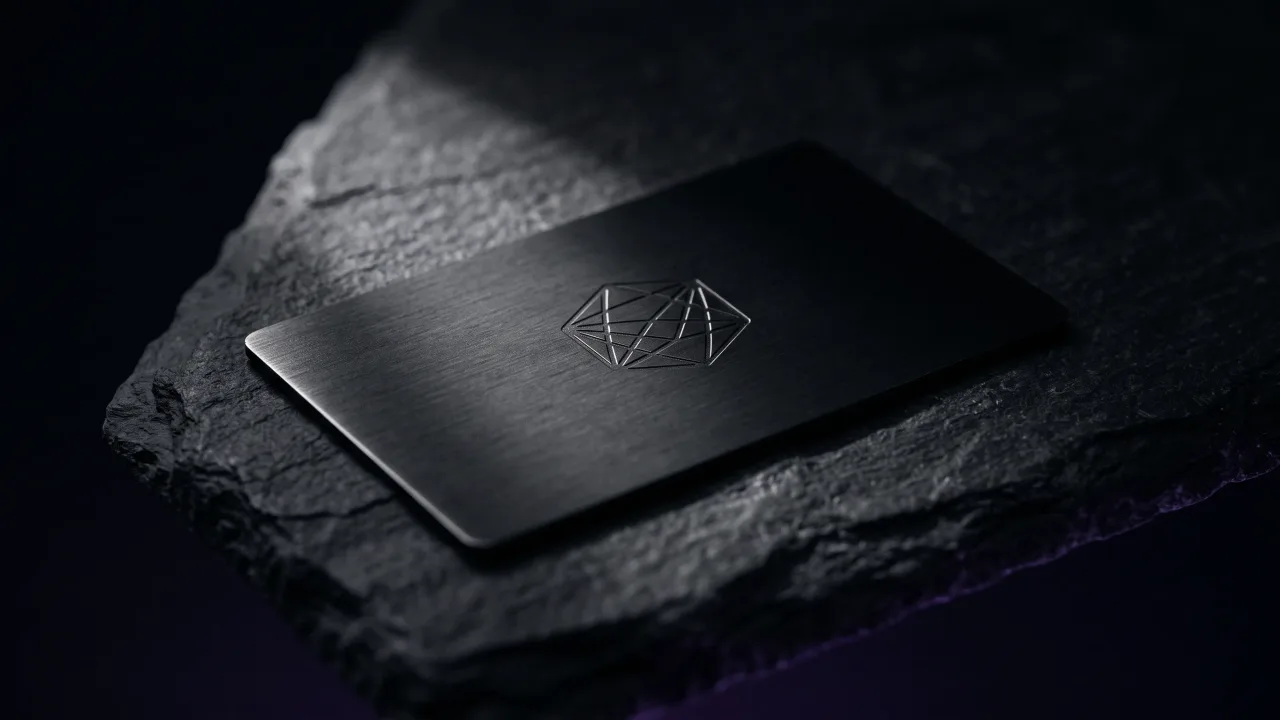
A good business card is a short, legible card on a material that feels deliberate, with one clear way to reach you. Most of the work is cutting things out. If you have to choose where to spend money, spend it on the material and leave the decoration off. If you asked us for one design, it would be black metal with a name, a role and a QR code on the back.
Pick a material, set your name in a font that reads at arm's length and see the card before you order.
Design your cardWhat makes a business card stand out?
A clear hierarchy, generous white space and a material people notice in the hand. Unusual stock, metal or wood stands out more reliably than busy graphics. One bold choice works better than five small ones.
What should a good business card include?
Your name, your role, your company and at least one way to contact you. A QR code or NFC chip that opens a fuller profile lets you keep the card itself short. Leave off anything a stranger wouldn't use.
What is the best font size for a business card?
Printers usually recommend at least 7 to 8 pt for contact details and noticeably larger for your name. Go bigger on dark or metallic cards, where contrast is lower. Always check a printed proof at arm's length.
Should a business card be double-sided?
Usually yes, if you have something useful for the back. A QR code, a logo or a short line about your work fits there without crowding the front. An empty back is fine too, and some people like it for handwritten notes.
Are minimalist business cards better?
For most professionals they are, because they are faster to read. Minimal doesn't mean empty: the name, role and contact route still need to be there. The style works best on a good material, which gives the card its weight.
Which type of business card is best?
It depends on how often you meet people and how often your details change. Paper is cheapest per card. A metal or wood NFC card costs more once but opens a profile you can update, so you don't reprint after every change.